After our Attention Insight Preview, we were very eager to try it out ourselves to see if we could get some feedback on our tinkering, helping us improve how we deliver our message.
That’s what we’ll check for in this Attention Insight Review, and what our expectations are: easy to get feedback on how to improve the clarity and attention focus on our websites and images.
It Begins with the Onboarding
As soon as we join, we will receive an e-mail with a very quick video that tells us how to use Attention Insight.
Studies
Afterwards, we can use the Demos inside the dashboard, to see how they were prepared and understand how it works ourselves:
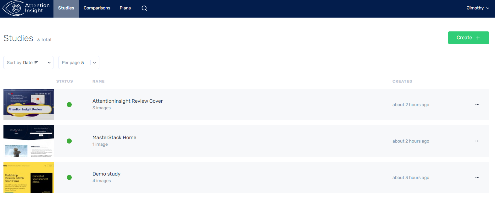
The interface looks clean and it’s very easy to get started, we just Press Create, and then we either put a link or upload our images.
We checked out this very featured image and our own homepage, to see a real example:
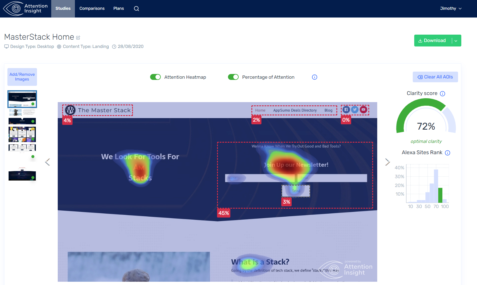
Attention Heatmap is what the eye will see, whereas Percentage of Attention are areas we place ourselves and Attention Insight will tell us how much attention those particular areas get.
On the right we have a Clarity Score and a comparison against the top 170 Alexa sites in that category.
It was very easy to use and it’s also very easy to take feedback on. We’ll see that on our images.
We changed image 3 times to better account for its low clarity score and generally I agree completely with its suggestions:
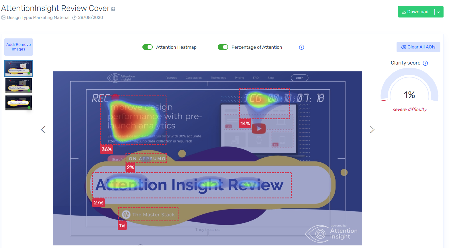
We clearly wanted most of the attention on the Title “Attention Insight Review” and the areas close to that, however it seems our original intent was not working, and we do agree after watching this heatmap: our end result was not what we wanted. So we tried again, changed some things.
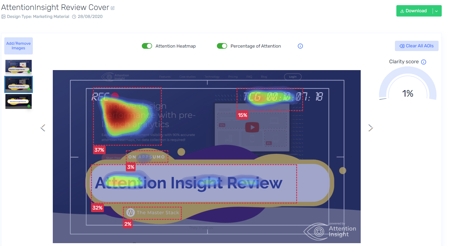
A bit better, less confusion with a darker background. However we can clearly see distraction signs with the random numbers, REC and so on, and evidently our title is a bit too low to be interesting. So we took this for a 3rd spin.
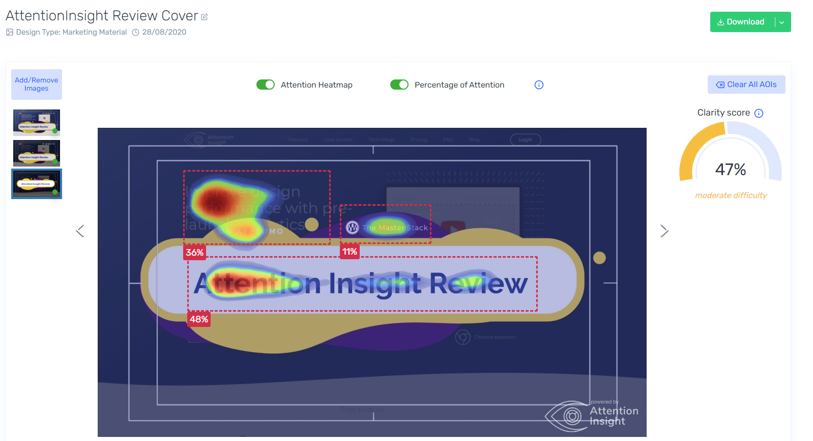
This is our third attempt and we finally have a clarity score, meaning it’s not too confusing, and attention is mostly where we want it too. It’s not great, but it’s a clear improvement.
After comparing it ourselves, I completely agree with Attention Insight’s evaluation, too. So I can already see how this can be extra useful for most of anything.
Comparisons
There’s a handy ready-made comparison demo we can also check.
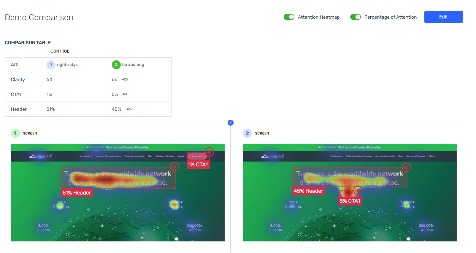
As we can see, there’s difference just by moving the CTA from the header menu to below the header. Attention shifts a bit, the header loses some but the CTA gains, and overall the whole interface is slightly more clear.
This is very useful for those finishing touches and getting the final design ready.
Attention Insight Review In Conclusion
We’ve already considered Attention Insight’s Price and how Designs are used. In our tests, we’ve used 4 designs: one for the web page, and 3 for each image we tested. That’s alright, it does make sense and at 100 per stack it seems fair.
Back to our expectation then: Did we get actionable feedback in an easy manner?
I would say yes, we certainly did, and I want to make sure to test my ideas with Attention Insight from now on, before making use of them.
I also am quite happy with how I understood the heatmap and agreed with it. When explained with the heatmap it was obvious what I should do, so it was very easy to understand and change accordingly, it felt like I was getting realistic feedback I just did not think about.
That’s the answer we were hoping for, so one more tool for our stacks, and let us know if you’re also happy with Attention Insight!
Attention Insight Review Card

Name: Attention Insight Review
Description: Attention Insight's AI helps you improve your design with actionable feedback, heatmaps and clarity scores.
Offer price: 59+
Currency: USD
Operating System: SaaS
Application Category: Data Analysis
Summary
Attention Insight met our expectations and delivered valuable feedback right on the first time we used it. It is very easy to use and allows to clearly see how we can improve our website design as well as our images.
-
Features
-
Ease of Use
-
Price
Overall
User Review
0 (0 votes)Pros
- Easy to use
- Feedback is clear and easy to act on
- Clean interface
Cons
- There are limits in how much we can use it, but they’re completely fair in our opinion. It’s more of a “remember the limits” than a Con.


